In mid-October 2021 the image in Figure 1 was posted on LinkedIn, accompanied by the following text.
NASA’s GRACE satellite has generated a geoid map of the earth based on the magnitude and shape of the globe and shows us an interesting image. In the picture, we can see several warped dots and various color shades, which represent the magnitude of gravity at that specific point. From what we see, the distribution of matter on earth is not perfectly uniform and therefore neither is gravity. According to this distribution, the lesser-serious area would be near the Indian Ocean, while in the central part of Europe and the north of the Atlantic Ocean there is the highest index of gravity.
This post attracted a modest number of comments, some of which were object lessons in the perils of attempting to disseminate science via a platform that restricts posts to 2500 characters and comments to 1250 characters.
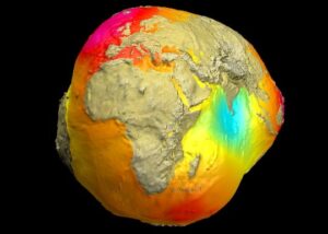
Figure 1. A visualization of the Earth’s gravity field produced by the Helmholtz Centre of the German Research Center for Geophysic (GFZ). The marine areas are coloured according to the long-wavelength component of free-air gravity, and the image in the land areas is a shaded relief display of actual topography, using a vastly exaggerated vertical scale. The apparent shape of the Earth shows the shape of the geoid, with even greater vertical exaggeration.
It was very evident from the comments that very, very few of those writing in had any real understanding of what the geoid actually is, so it as well to quote a standard definition.
The geoid is the gravitational equipotential surface that coincides with mean sea-level.
For most people who are neither geodesists nor geophysicists (and even for some who claim to be one or the other) that definition is pretty meaningless, but the GFZ image at least gives it a pictorial meaning. The potato shape is a representation of the shape of the global sea level surface. No-one, however, should be allowed anywhere near the image until has been pointed out to them that the Earth’s average radius is about 6395 kilometres (6,378,000 metres at the equator, 6,356,000 metres at the poles) and that the total variation in the height of the geoid is less than 200 metres, from 85 metres above the Earth ellipsoid to 106 metres below it. That is a measure of the degree of exaggeration involved in the preparation of the ‘potato’. A rough eyeball estimate suggests a vertical exaggeration factor of rather more than 200,000. That much distortion can lead to some very major misunderstandings amongst the uninitiated. An Assay Manager, having looked at the image, commented:
“I wonder if the Z-axis has a scalar to enhance the visual.”
A Reality Capture Specialist (whatever that may be), thought that:
“It would be interesting to see if there were any research into connections/correlations with ways of life, diseases/illnesses etc with this map, very interesting stuff”
And, in a similar vein, an organic farmer asked:
“What effect does this have on humans?”
To which a Business Development Executive responded:
“Exactly my thought! Does this have some impact on why I feel so much better when I’m not in the UK and am off somewhere around the world in a lesser gravity situation?!
Also… Might this have something to do with why megalithic creations could be erected in Africa and Middle East? Did they tap into the knowledge of this somehow? “
And, as another answer to the question, it was suggested that
“Over 12,000 years…probaby taller people in some places and shorter people in others.”
Had these commentators been aware of the magnitude of the distortion, they might have been less willing to consider such possibilities. But why should they have been? None claimed any specialist knowledge. What was less forgivable was a comment from another Business Development Manager, who combined that with ‘Geologist’ in his self-description. He said that:
“What immediately comes to mind, for me, is the implications for athletes across the board. Does this mean that training in higher gravitational areas, then competing in the lesser, could (theoretically) result in improved performance?! “
That of course, has more to do with gravity field than gravitational potential, and the absolute field strength at sea level varies by about a half of one percent, from a minimum at the equator to a maximum at the poles, so the weight of an athlete at one of the poles would be very unlikely to be even as much as one pound greater than at the equator (unless he were a Sumo wrestler). Theoretically, perhaps, an advantage to someone who did all their training in the polar regions but many athletes choose to train at high altitudes, where gravity is even weaker, because of the advantages accruing to a body that has been forced to make more efficient use of oxygen.
An actual geophysicist had a very different thought. In his opinion:
A standard oblate spheroid with observed gravity as a linear colour histogram is better for most purposes, and should show variation with latitude better.
Which opens up a whole new field of thought. The colour shading of the ‘potato’ is determined by free air gravity, which is obtained by correcting for the theoretical change in gravity with latitude (and also for height above sea level, but the GFZ image is colour shaded only at sea, where conventional measurements are made at sea level). That prompted the thought – what would a global map look like that was shaded for absolute gravity, not corrected for latitude ? That is a map I have never seen, and would actually be quite instructive. It would be dominated by the change in gravity with latitude, but not to the extent that changes due to geology would be invisible. It might be a very good introduction for students (and a reminder for those beyond that stage) of the relative magnitudes of these two effects.
But what about the variations in free-air gravity, which are the variations that are being shown by the colours,? There were questions asked about those too. In fact one of them was asked by someone with an MSc in geophysics.
“Can you share a link of NASA’s research to help understand why Pacific Ocean shows lower gravity than Atlantic Ocean?”
Which is a little odd as a question in this context, because almost none of the Pacific is visible on the image that was posted on LinkedIn. The Indian Ocean, on the other hand, is very visible, and coloured as a gravity low. Suggested reasons tended to focus on the fact that sea water is much less dense than rock, although an oil-industry professional asked:
“Is the central control the oceanic and continental crustal thickness?”
A Petroleum Engineer, on the other hand, suggested that :
“One thought is Pacific Ocean is deeper so more water and hence lower gravity. When I was involved with microgravity survey for H2S flood front, as it displaced a more dense fluid, in situ water, the gravity value dropped where H2S displaced water.”
Which is all very well on a local scale, but on a global scale the influence of isostasy cannot be ignored. The fabric of Planet Earth is not strong enough to sustain large mass imbalances over long periods of time, and the gravity effect of the low-density water layer in an ocean is, on a regional scale, balanced pretty exactly by the gravity effect of the high mantle beneath the thin crust of the oceanic area. The main sources of the regional highs and lows in Figure 1 must lie much deeper, where dense subducted slabs are stranded or sinking very slowly. The major geoidal bulge in the Indonesia region overlies an area where subduction zones are, and for a long time have been, clustered together like nowhere else on the planet. Dense oceanic crust has sunk into the mantle in this region, and become even denser on its way down thanks to pressure-induced phase changes. The results of processing gravity data from an earlier satellite are shown for that region in Figure 2.
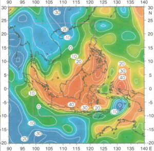
Figure 2: A higher resolution, but still long-wavelength (800 km+), image of the Indonesian free-air gravity high. High values (in milligal) are concentrated above the locations of the deep subducted slabs under Sumatra, the Philippines and Halmahera. See Milsom, J. & Walker, A. 2005. The gravity field. In Barber, A.J., Crow, M.J. & Milsom, J.S. (eds) 2005. Sumatra: Geology, Resources and Tectonic Evolution. Geological Society, London, Memoirs, 31. Original GEM-T3 satellite data from Lerch et al. (1994)
The Indian Ocean, on the other hand, has a long history of expansion, without any subduction beneath it.
Perhaps the last word, or two words, on the ‘potato’ should be left to a surveyor. After all, these are the people who really know about the geoid.
“Incredible image.”
I think that says it all.