I imagine that anyone trying to write a history of anything is all too aware of the probability (near certainty) that something important will have been left out. Sometimes new documents will emerge after the book or paper has been finalised, sometimes things just get overlooked. When writing “The Hunt for Earth Gravity” I certainly managed to overlook a number of things that would have gone in had I known about them.
One of these concerned the last days of regional pendulum surveys. In 2017 the Geological Society of London published Memoir 48, ‘Myamnar: Geology, Resources and Tectonics’. In it there is a chapter by Win Maw on the contribution of geophysics to petroleum exploration, and in that chapter there is a map showing Bouguer gravity contours covering some 80,000 square kilometres of the country. Inevitably, the work concentrated on the Tertiary basins and, astonishingly, the measurements on which the contours are based was all done in 1939-1940, just before the Japanese entry into the Second World War. Even more astonishingly, the measurements were all made using pendulums, not gravity meters. The actual number of readings taken is not stated but the statistics given suggest that there must have been several thousand. It could have been one of the largest land-area pendulum surveys ever undertaken, as well as one of the last,
On the map in the Memoir, colouring was used to indicate Bouguer gravity values, with colour changes at 10 mGal intervals and intermediate, 5 mGal, contours in areas where gradients were low. Unfortunately, it is not always easy to work out where this has been done, and in some places it is impossible, because there are either too few or too many contour lines. In principle the colours should allow this to be worked out, but there are difficulties in distinguishing between some of these and in some places a necessary colour band has been simply omitted. I have made an attempt to assign values to all the contours, but there are some areas of uncertainty. Fortunately, these do not affect the lowest values (below -60 mGal) or the highest (above +20 mGal).
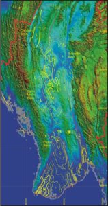 A coloured contour map is excellent for a quick appraisal of the main characteristics of the gravity field, but it is not easy to use such a map to relate gravity features to topography and, via topography, to geology. Just for fun, I have drawn a map based on the pendulum data in which the 20 mGal contours (in which some confidence can be placed) are shown by thick lines, thinner lines are used to contour the intermediate tens and dotted lines are used for intermediate fives where these were shown. These contours have been overlaid on a topographic image derived from the Satellite Radar Topographic Mission grids, rectified on to UTM Zone 46, which is currently the standard used for mapping in Myanmar. The map shows the expected lows over the main sedimentary basins and, as noted by Dr Win Maw, there is a small high associated with Mt Poppa, slightly displaced from the volcano itself. This displacement may be a contouring artefact, since post-war gravimeter surveys showed a much closer correlation. Possibly the most interesting feature of the map is the strong linear high that coincides with the Lower Sittang Valley. It is very unusual in mountainous areas for strong gravity highs to be associated with the valleys rather than the topographic highs.
The results of the post-war surveys, which covered roughly the same areas as the pendulum surveys, are shown on a second gravity map in the Memoir, . There are contouring errors on this map also, but it seems possible that the main ambiguities could be resolved by cross-correlating the gravimeter and pendulum results. This could be my diversion during the long winter evenings, whilst others are tackling Sudoku.