Late last year Hugh Davies initiated a discussion centred on the Dayman Dome of eastern Papua, by asking whether anyone in his circle had imagery better than those he was using. He didn’t specify what images he was using, but perhaps something like that shown in Figure 1, which is what GoogleEarth currently provides. Not brilliant, but a long way better than what we had available to us when he and I were sharing a helicopter for geological and geophysical mapping of the area, some 55 years ago.
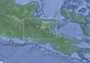
Figure 1. GoogleEarth image of the eastern end of the Papuan Peninsula. The white rectangle defines the area covered by Figures 2 and 4 and partially by Figure 5.
In answer to his request, Dorothy Pion of the Mineral Resources Authority of PNG stepped up to the mark and provided an image of the area within the rectangle on Figure 1.
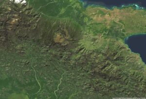
Figure 2. Papua New Guinea Mineral Resources Authority photographic image of the eastern and central parts of the Dayman Dome
A great improvement, of course, on Google Earth, and vegetation patterns can be very revealing. However, they can also be concealing, and even coastlines can give a rather misleading impression of what is going on.
There is another way of looking at this area, and that is to create one’s own image, using the SRTM 90-metre grids and, just for fun, de-emphasising the land-sea boundary. Doing that turns the Cape Nelson Quaternary volcanic complex into an offshore island, and turns the swamp created by the volcanic products into a seaway. It gives one a very different feeling for the structure of the peninsula.
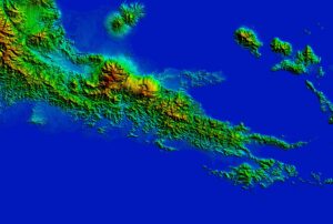
Figure 3. Topographic image based on SRTM 90-metre grids of the eastern part of the Papuan Peninsula, roughly corresponding to the area shown in Figure 1
The regional topographic image shown in Figure 3 also seems to promise a very different way of looking in detail at the Dayman Dome, and in fact it does.
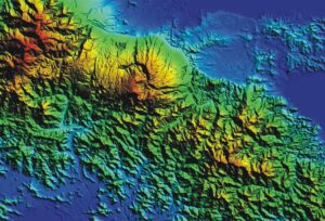
Figure 4. Topographic image based on SRTM 90-metre grids of the eastern and central parts of the Dayman Dome, the area covered by the MRA image of Figure 2.
With that image available, the obvious next step is to look at the geology. Figure 5 is a scan of part of the Tufi 1:250,000 geological map, the result of the mapping by Hugh and by Ian Smith and others fifty years ago. Not the best of images, having been produced by placing a map that was probably last unfolded forty years ago on an A4 scanner. Also, the area covered is rather smaller than that covered by the topographic image. This is very much work in progress.
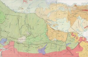
Figure 5. Geology of the eastern and central parts of the Dayman Dome, showing the north-eastern part of the area covered by the MRA image of Figure 2.
And food for thought.
Definitely work in progress