Climate of suspicion
I really shouldn’t be doing this.
Let me state, right from the start, that I have no special expertise in climate science. I am an exploration geophysicist, not an atmosphere geophysicist, and am not qualified to assess climate models, or the predictions. Nor is that part of science something I want to get into. But I am on LinkedIn, and because I have a background in the petroleum industry, many of the people in my network are also from that industry, and some are very sceptical about the reality of anthropogenic global warming. Scepticism is great, and vitally important, but it does constitute a quite disproportionate of my incoming posts. Which is irritating, and it is especially irritating when science itself is being distorted, and perfectly good scientists are being misinterpreted and traduced. At that point anyone who claims to be a scientist needs to stand up and defend science.
A few weeks ago the heavily annotated diagram shown below appeared on my LinkedIn feed. The petroleum engineer who posted it, and who would, one would hope, be numerate, claimed that it showed that “ The government welfare funded klimut siyentists suicided their hypothesis with THEIR OWN NUMBERS. They imply (but conceal using complex circumlocution) creation of energy, and imply also that heat is a process of transient energy flow from cold to hot, violating each of the 1st and 2nd laws of thermodynamics”. “Plant food”, incidentally, is his name for CO2.
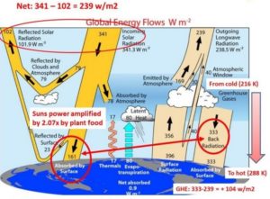
Diagram A
Now, one has to admit that the original diagram on which this was presumably based was itself not very good. It appeared in a 2013 paper entitled ‘The global energy balance from a surface perspective’, with Martin Wild of ETH Zurich as the lead author, and is shown below. He and his co-authors obviously thought that it was clear and self-explanatory, and perhaps it is, to a climate scientist. The rest of us have to work a little bit harder, and Diagram A would actually have been much the easier of the two to understand, if only it had been presented without annotation. With the two together, there really is no excuse for misinterpretation, even though the numbers are slightly (but only slightly) different in each.
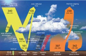
Diagram B
First, the colours need explanation. Yellow is for the energy received as high frequency, short wavelength, radiation from the sun, orange for the low frequency, long wavelength energy radiated from the Earth or its atmosphere, some of which will be re-radiated absorbed solar energy. The Wild et al. diagram does not distinguish clearly enough between overall energy flows and the secondary energy flows into which they are split, and it takes a little (but only a little) bit of thought to work out that the 340 units of incoming solar radiation is split into 100 units reflected from the atmosphere, 79 absorbed in the atmosphere and 161 reaching the surface. That is 340 units fully accounted for.
The other numbers on the yellow side? The 161 units absorbed and the 24 reflected represent the fate of the 185 ‘solar down to the surface’ units , and the 24 units then form part of the 100 units total that is radiated back out into space. There should also be a 76 on the diagram, for the radiation reflected, mainly from clouds, before it ever reaches the surface; Its equivalent is shown on Diagram A, but as 79 out of a total reflected 102.
Why the difference? I don’t know where Diagram A originated, but I do know (because I have read Wild et al.) that the numbers on Diagram B are the authors’ best estimates of energy flows, based on actual measurements. It is not surprising that a different group, or even the same group working at a different time, would come up with slightly different numbers. Anyone who wants to dispute their individual validity is entitled to do so, but what they are not entitled to do is present the numbers and then assign them roles not assigned to them by the original authors.
On the right of diagram B, the Earth is shown as radiating 397 units, more than double the 161 of solar it retains, and it is also losing 85 by evapo-transpiration and 20 convection. There is, however, a near balance, because it also receives 342 in energy radiated from the atmosphere. This is vastly more than the 79 units that the atmosphere is receiving from the sun, but the atmosphere is already ‘hot’ – on average it is at around 300° above absolute zero, when those 79 units arrive. How it got to be at that temperature is a matter of Earth history, going back literally billions of years, but totally irrelevant to the diagrams as presented, which are concerned with the here-and-now..
It is at this point that the ‘petroleum engineer’ misapplies the laws of thermodynamics, claiming that they exclude the possibility of “energy flow from cold to hot”. They do not. Any body at a temperature above absolute zero will radiate energy, and a hotter body that gets in the way of energy radiated from a colder body will absorb some of that energy. Because it is hotter, it will radiate more than it absorbs, so the NET energy flow will be from hotter to cooler. That is what thermodynamics says, and what the diagram shows. The Earth and the atmosphere are massive heat sinks that store and re-distribute energy, and no-one who fails to appreciate that can hope to understand the physics of the atmosphere.The Earth is receiving 342 units from the atmosphere, but radiating 398 units to it. That 397, plus the 85 and 20 units of mass transfer energy, is almost equal to the 161 plus 342 the Earth is receiving.
Almost equal, but not quite. 397+85+20 is 502, and 161+342 is 503. That imbalance is represented by the 0.6 of a unit down on the bottom left of Diagram B, which is the only quantity not rounded out to the nearest whole number. If it were rounded up to 1 and included, the balance would be perfect. That 1 unit is the ‘global warming’, and Wild et al. presented it as a number based on actual experimental data. It is this number that global warming sceptics should be focussing on, not a number produced, as in Diagram A, by subtracting the net solar energy input (239 in that diagram) from the energy radiated from the atmosphere (333 in that diagram) and calling that the GHE (greenhouse effect). Science cannot be done by cherry-picking some numbers in a data set and ignoring others that are just a relevant.
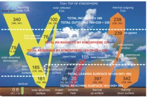
Diagram C
In an attempt to reduce the confusion, but possibly merely adding to it, I have produced my own annotated diagram, based on Diagram B. The dashed lines divide it into three zones, one for space beyond the top of the atmosphere, one for the atmosphere itself, and one for the Earth’s surface. I have added and annotated some numbers in the middle zone that I hope clarify things a little, e.g.104 for the 84+20 of the two mass-transport mechanisms. There is an excess of 1 unit of energy coming in at the top of the atmosphere (340 – 339), and that appears as an imbalance of 1 unit at the Earth’s surface (503-502). Rounded off to the nearest 1 unit, no energy is retained by the atmosphere, but this is of course just one of the numerous simplifications involved in the production of the diagram. Any and all of those simplifications can be challenged, but those challenges should be based on properly understood science, not prejudice.
Note. The units throughout are Watts per square metre and are, strictly speaking, units of energy flow or power, not energy itself. A watt is equal to one joule per second. One person commenting on the original LinkedIn post asked about the contribution made by the loss of internal heat from the Earth. This is of the order of 0.1 Watts per square metre, and so very much smaller than the uncertainties in any of the flows shown on the diagrams.